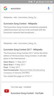
While below is the new design in Search app.
And last is the new design in web search. (Browser).
The new design removes the blue link color, as well as the green color for page categories/directories. Google tried something similar last year on the desktop, and people weren't happy about it then either. As you can see in the third screenshot, the design also applies to the web search.
Am i the only one who feels the old design is the best for now? For me, i still prefer the old Google search UI; it's colorful and has more features than the new design. I just don't understand why Google feels the need to do this. Can someone just tell Google to leave the old design alone.
What's your say on this? Let's hear you via the comment box below.


That's good
ReplyDeleteall good www.safaxnet.com.ng they try sh.... small Commenting from SAFAXNET BLOG
ReplyDelete